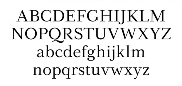
Trends come and go. There were times when some of these fonts reigned supreme, some still do. Let’s see what are the top 5 fonts that past generations used to craft books, letters, last will and testaments and so on.
1. Garamond
We start with the oldest entry first. The Garamond font is named after Claude Garamond, a Frenchman who lived during the 16th century. He worked under a famous printer but did not completely succumb under his influence alone. He worked on his own style and the style sooner than later became his very own type font. The popularity of the font made it all way from France to Switzerland, where a swiss printer christened the font after its creator Garamond. Today it might not seem like such a feat that something catches on in one country after its been popular in the next, but in the 16th century, it sure was.
2. Baskerville
This typeface is legendary in this own right. It has seen praises from even some of its very big competitors like Benjamin Franklin or the inventor of another entry on our list Giambattista Bodoni. And, its creation is a story similar to many others. Its creator John Baskerville wasn’t impressed by the works of other typeface creators and he thought he could do better. He was oh so right. His typeface has stood the test of time for almost 3 centuries. People have tried to add something of their own creativity to this font and have created a number of variations, out of which the New Baskerville is perhaps the most famous and used font. If you are intrigued by the variety in this popular font, be sure to check the whole variety of Baskerville fonts with Typewriter fonts on fontsly.com.

3. Bodoni
During the later half of the middle ages, Italy was a haven for many artists and people who excelled at creating. Many famous artists during those times were Italian, From Leonardo to Michelangelo, to the writer Dante or Machiavelli. They were all Italian, under the safety net of powerful rich men who would give them money and creative license to do as they please. The same can be said about Giambattista Bodoni. He lived under the grace of Duke Ferdinand of Parma. The duke was a lover of arts and especially the new, emerging art of printing. He was so impressed with Bodoni and his craft that he helped him to open a printing office in his very own palace. Bodoni, like every great artist who was given enough time and funds to complete his work, gave him a timeless typeface.
4. Futura
Created in Germany in the 20s of the 20th century, this font is the hallmark in lettering geometry. Many have tried to top this font for its simplicity and symmetrical beauty and they have all failed. It might not be as big all over the world, but in Germany, many firms and business still use it quite frequently. The biggest proponent of the Futura is by far the German car company Volkswagen. It has also influenced a lot of new typefaces, each and every one of its spawns created to ideally convey a sharp business sense.
5. Helvetica
The last entry on our list is probably the most famous typewriter font ever created or used. Since it has been created by the Swiss designer Max Miedinger in the year 1957 many have crowned it the king of fonts. It is easy to see why. Every single letter exudes geometry, beauty, elegance, and symmetry. The Helvetica is much like the Swiss people, simple but always trustworthy, stable, never swayed by the times.
As the times go, one is easily swayed by the new. It is exciting, like something that you never saw before, sparkly and so unique. At least that is how it is presented to us. But some things are eternal. The same is true for all the five fonts we have mentioned in this article. When you craft something important next time, or if you want your audience to know that you are a person of history, style and knowledge, be sure to use some of these fonts. For tens or hundreds of years they have been used by the most important people in their times. Be sure to continue that tradition.


