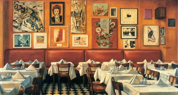
Hanging Artwork like a Parisian
Salon-style wall hangings have a long and colorful history tracing back to the salons of Paris from the 17th century onward. They’ve been enjoying a renaissance of sorts in the living rooms and bedrooms of stylish people today. The distinctive mix of frames and artworks, haphazardly arranged on the walls with little blank space left in between, has been a beloved feature in design magazines and editorials for a few years now.
While this bold mélange of art, and sometimes photographs too, makes a bold statement and is a great way to pull together a large, blank space, actually achieving the look is rather daunting. It takes time to find the perfect arrangement for all of your pieces, never mind deciding on which works of art to include in your collection. Framing can also be a challenge, since the look really comes alive when you’ve used different frames to create aesthetic distinction between artworks.
Before we delve into the future of our very own salons, it’s useful to look back on their beginnings in Paris for inspiration. Understanding the purpose of the original salons will help give your own project a boost.

What Paris Salons Teach Us about Hanging Art
The Salon was a royally sanctioned art exhibition, first opening its doors in 1674. The École des Beaux-Arts, arguably one of the most famous art schools in history, supplied the material for the shows from the work of recent graduates. In these halls, rich patrons could buy up the work of new artists, making or breaking their entire careers. In fact, a successful debut at the salon was the only way to make it as a visual artist in France for around 200 years after it started. So, it was a pretty big deal.
The key for these graduates was to stand out against the backdrop of other artwork. Uniqueness, technique and beauty were key to achieving this. When you look for your own artwork to put up on your walls, don’t worry about finding pieces that work well together – above all else, find pictures that stand up on their own under close inspection. Look for pieces at second hand sales (a great place to find frames, too), or invest a little extra in a limited edition print from an artist and become a patron yourself. We love Lumas for offering fairly-priced prints that also support international artists, from painters to photographers.
Another tip is to mix smaller and larger prints on the same wall, allowing viewers to enjoy art from afar or up close. Small frames invite the viewer to huddle in to get a closer look, creating a feeling of intimacy that can transform a small space. So be sure not to overlook the smaller items.
Remember, in the early days, there would be up to 400 artworks hanging up at a time in a salon for visitors to peruse. That means it wasn’t practical to be too precious about arrangement. The idea was to tack as many paintings onto a wall as possible, not to create wondrous displays. In your own projects, feel free to embrace a chaotic style; the more organic your organization looks, the better. This is about creating a human space, not a measured grid.
And if you want to feel like Royalty, then simply keep collecting and adding pieces to your wall. In the old days, you wanted to impress your visitors with the sheer quantity of artwork in your possession. It was a sign of wealth, after all. Today, you can be more restrained and can feel free to rip out pages from a magazine for a cute frame, or print out snaps from your computer to add to the mix. In the end, it’s your salon.