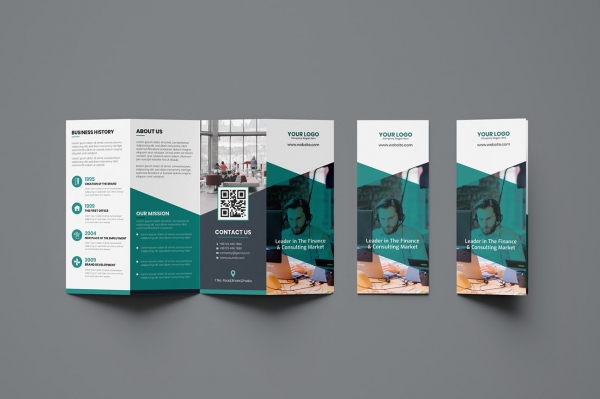
One of the best ways to help build your brand through offline marketing is brochures. They are a great method for keeping customers up-to-date on products and services, new events, or special sales and discounts. If you are interested in using brochures as part of your marketing strategy, the key is to make them look professional, beautiful, and modern. They must attract the eye, but also have easy to access information.

Creating brochures might be daunting for many business owners, but it can be easy by using an online service like My Creative Shop. These services allow you to easily find brochure templates on their sites. Once you choose one to your liking, you can easily build a brochure by plugging in your photos and information. You don’t have to be too creative to do this. The layouts are all professionally designed to make your brochure as professional and attractive as possible. Here are some possible brochure types you can find online that are quick to make and affordable for the upcoming year.
Clean and Minimalist Designs
In 2021, you should be looking for brochure templates that provide a more minimalist look. There isn’t a lot of clutter with this type of design, and it’s easy to find information. These designs tend to be easily customizable, so you can move elements around to create the perfect brochure for your business.
They can be built in most sizes for mailing, as well. The clean design is perfect for when you want to look professional and not have too many distractions for your audience. They are very flexible and can be used for many different brochure types. Minimalism is becoming more popular with home design, and it should be your choice with brochures as well.
Minimalist design also means minimalist when it comes to writing. Use short sentences that get the point across quickly. Your paragraphs should also be just a few sentences long. Bullet points make it easy for the reader to find and summarize information. In this world of cluttered websites and being bombarded with data at all times, a simple, clean and uncluttered look will go a long way towards creating a great brochure.
Pictures
A picture can say a thousand words, and if you choose the wrong pictures, those words won’t be good. Make sure that you choose the right pictures for your brochure. They should be attractive to the eye, but also provide context for the printed information that accompanies it. It is usually a good idea to have a professional take photographs for you, or you can choose some from an online photo purchasing website. Unless you are very skilled, the images you take on your mobile phone won’t have the same high-quality look as professional photos. They won’t capture the right lighting and angles that will make your pictures stand out how you need them to.
Keep Your Customers In Mind
You should already be keeping detailed customer demographics records to improve your marketing. If not, you should start immediately. You need to know what makes your customers tick, and why they choose you. That way, you can tailor your messages to your ideal customers. This means understanding what problems they have, and how you can solve them. You don’t have a lot of space to get into details on a brochure, so you need to get to the point and make your case. Your design should reflect the needs of your clients, and provide you a platform to highlight the services and products in which they might be interested.
Don’t Get Cute With Fonts
The average reader has spent enough time online reading text that they are used to certain things. If you start experimenting too much with fonts, it can be confusing or hard to read for the audience. Choose a font that’s professional and easy to read so that your information comes across. Usually, a sans-serif font is a good choice. Make sure that titles are bolded or underlined so that they stand out and readers can quickly find the information they are looking for.
Make Clear What You Want Your Audience to Do
While you always want to convey information clearly, it’s also vital that your audience knows what you want them to do. Otherwise, you’re just giving them information with no context. Always include a call to action. This will get the reader to visit your website, order a product through your business reply envelope, or come to your storefront for a visit. Whatever it is you want them to do, make it very clear to the audience. Otherwise, there’s a good chance that they will read your brochure and quickly toss it in the recycling bin.
When building your business, you need to take any opportunity for effective marketing. Even in 2021, a brochure can be a powerful tool to reach potential customers. Make sure that your brochure design reflects a modern time, and includes all the elements that will make it stand out in the pile of mail that everyone gets and often ignores.


