A Color-Based Approach to Selecting Images for Your Project
To keep it simple is a popular approach, which is beneficial in many situations. When you, as a photographer, marketer or just a blog holder, struggle to come up with an original design concept for your online project, consider going back to basics. Searching background images by colors can be a great way to boost your blog or webpage easily. This is because color themes are an important marketing tool overlooked by many.
To educate yourself, read these useful advices on how to tackle with photography background problems.


To brighten up your blog, you can take advantage of image collections classified by colors. The pictures are mostly universal, so you may find them useful no matter what your project is about. Aspiring artists can use them as a source of inspiration to conduct their own deep research on different color backgrounds. The collections also contain images with different objects and people. Whether you use them directly or just to draw a creative idea, this approach can save you lots of time and efforts.
Blue themes are perfect when you want your page to evoke associations with the sky or sea. This will help your visitors know right away they can find tranquil, peaceful experiences here.
By choosing a theme in green colors, you refer to nature, environment and freshness. In a broader sense, this can be a reasonable choice if your project is about something new, which is expected to grow. Money is another topic associated with green for many people.
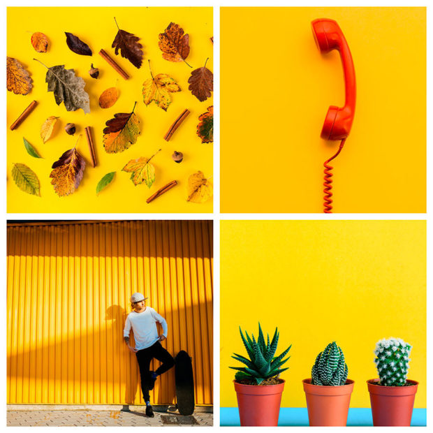
Yellow is the color of autumn and the sun. It is convenient to use to create a light mood. Orange color is not far from yellow. Images in the orange gamut differ in special warmth.
Red tones are used to add more energy and power to your content. This applies to love, passion and similar topics too.
Brown. The color of chocolate and coffee, home comfort. It is very popular in interior design and cooking-related images. Brown is directly associated with wood, soil, nature.
The color of gold is associated with luxury, wealth, traditions. Gold and its shades are very versatile colors that are used in a variety of situations. Akin to gold, but colder, the color of silver is no less popular in design and advertising.
For many years, the primacy of the most popular color in design keeps white. It is associated with purity, lightness and freshness.
Gray is good for creating a certain mood or for images related to weather, street, etc. Black and white photos will never cease to be relevant. Black color is good for creating a dramatic atmosphere.